12 Sep Graphic Design Trends 2015
New Killer Graphic Design Strategies and Techniques
Graphic design trends 2015 are based on the most used graphic designs in 2014 and the new techniques which are barely starting to be shown from the top classic graphic designers all over the world like Milton Glaser, Stefan Sagmeister, David Carson and the new best graphic designers from Behance . A flux of web and graphic designers has entered the market and has changed the entire outlook of working in the associated field of designing. The trends for the forthcoming year are quite simple as the designers are focused on keeping the designs high on the sophistication side and less complicated.
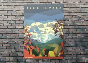
1. Super-Geometric
 Super geometric graphic design 2015 trends
Poster: Liam Brazier
Incredible detail, but straight lines everywhere… If origami was graphic design technique, this would be it.
Don’t be fooled by apparent simplicity though — the level of skill and attention required to produce this kind of work is not for the faint-hearted. That’s probably why this design style is trending.
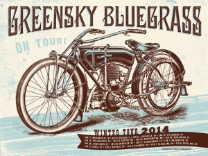
2. Handiwork

Poster: Status Serigraph
Craftsmanship is coming through the big doors. Detailed, 19th century style illustrations are your best bet, but high-fidelity illustration of any kind will get you serious attention. After decades of photography-driven design, serious drawings are in high demand again — and rightfully so.
3. Technical

Infographic: James Provost
Once reserved for boring instruction manuals, the beautiful art of technical illustration finally made its way into mainstream design with introduction of infographics. No need to explain the reasons — its clarity, simplicity and precision perfectly resonate with our chronic busyness and lack of time.
Obviously, you don’t have to learn the fine points of technical illustration. Clean lines and thoughtful use of color will take you a long way.
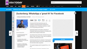
4. Pragmatic

Website: USA Today
A growing trend in digital design is pure pragmatism, or keeping things as simple and practical as possible. This is a combination of grid-based layout, minimalist design approach and clever use of color that makes websites and mobile apps easy to use and navigate.
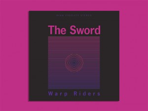
5. Retro-graphics

Album cover: Rodrigo Maia (via new records, old covers tumblr)
They say every design style comes back in fashion every now and then, and it seems this is a great time to revive graphic work from 70’s and 80’s. Back then, design approach was pretty modest due to technical reasons, but that fits perfectly with our sudden taste for simplicity and minimalism.
All in all, design work inspired by the times of arcade games and hit tunes will make big impact this year.
6. Full Frame Video as a Design Element
Video storytelling begins with the fact that a picture says a thousand words, and that a moving image says a whole lot more. Every video editor should know that the image they put on screen influences the overall story and is the main focal point for their audience. One trend that’s occurring with regular frequency in motion graphics is the use of video as background plate. In other words the motion graphics appear on top of a clip of video and the motion graphics are the focus of the piece while the video acts more as a background texture than it does as a narrative tool. An adept video editor will know that if the video is a background image, it can still speak subtly into the narrative of the motion graphics.
7. Composite Images
Graphic designers and photographers have embraced the trend of combining two or more images together to make surreal subjects in their art. The same thing is happening in motion graphics. Video editors are taking various video clips, shot in a cinematic style, and then compositing the images together to draw the audiences’ attention. It can be tricky to do, especially when trying to match the motion between two separate subjects, but if executed successfully, composite images serve the video editor well as an illustrative visual.
8. Shorter Content
The overall attention span of media consumers appears to be decreasing. People are more accepting of content that comes in smaller bites. Social media and web video are making an impact on how video is produced and viewed. As a result, there is a growing audience that likes to see videos — motion graphics included, that are only seconds in length.
This includes an interesting off-shoot, that’s not quite video and not quite graphic design. The animated GIF, a digital image format that’s ancient by internet standards, has burst back onto the forefront through the micro-blogging of Tumblr and the creativity of those making animated GIFs. A good animated GIF wraps the principles of the moving image and graphic design into a small span of several frames delivered as a looping animation. It wouldn’t be surprising for a client to ask a video editor to make an animated GIF out of a clip of video.
9. Practical Elements
Motion graphics aren’t necessarily entirely made from computer generated elements. Just as flat design bucked the trend of photorealistic renders, practical elements (real objects) are appearing and being used as design elements in motion graphics. This is similar in thought to the trend of full frame video, but instead of using the entire video clip, the subject matter is keyed or rotoscoped out and composited into the motion graphics sequence. Practical elements are frequently used in stop-motion videos. There’s a unique illustrative quality to using practical elements and stop-motion to create entirely new visuals when telling a story.
Conclusion
New trends are more creative but with solid concepts of what we learn from design school. As always, there are two parallel tracks in design trends this year — the vintage one and the contemporary one.
The vintage track is about detailed line drawings and illustrations, as well as retro graphics from 70’s and 80’s. The contemporary track balances with super geometric style, pragmatism and design inspired by technical illustrations.
These styles are so diverse and rewarding that every site can shine with any of these, but look nice and achieve your business goals can be different make sure your styles fits into your brand strategy, let our marketing and graphic design team help you choose the best for you.


